Clarifying a SaaS product by removing a feature that caused confusion
Addr is a SaaS platform that helps businesses collect and manage customer reviews. The core functionality was already built, but the product lacked clear UX and a professional presence.
The goal was to launch quickly with enough clarity and trust to attract early paying customers, while setting a foundation that could scale.
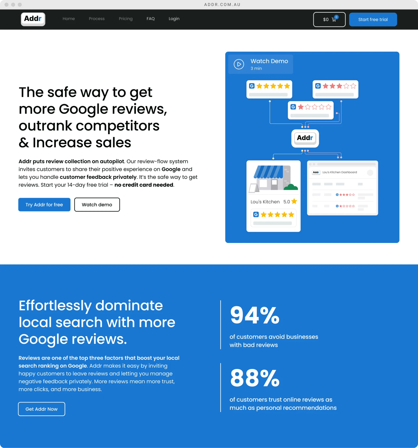
Although the backend was functional, the product only made sense to the developer who built it. New users struggled to understand what Addr did and how to get started.
There was no clear path from website visitor to paid subscriber. Without a professional website and a clear onboarding flow, the risk was not usability alone, but trust. If people could not quickly understand the value, they would not convert.
Time was tight and resources were limited. The product needed to launch fast.
There were two competing priorities that had to be solved at the same time:
We had to decide where clarity mattered most and what could wait.
Early on, we bundled Addr with NFC business cards in three formats. The idea was that the cards would support the software by making it easier to collect reviews in person.
In testing, the cards became the focus. Instead of understanding Addr as software, people thought we were selling business cards.
What was meant to be a supporting feature ended up distracting from the core product. We were solving too many problems at once, and the main value of Addr was getting lost.
We chose clarity over flexibility.
This decision was made collaboratively with the founder and developer, but I pushed strongly for reducing scope to improve understanding. Removing the cards meant letting go of a feature some users found interesting, but it reduced confusion at the most critical point, first contact and on boarding.
Once the cards were removed, the story became much clearer. Testers immediately understood that Addr was software designed to help businesses manage and grow reviews.
This simplified everything downstream. Website messaging became more focused, onboarding flows were easier to follow, and we no longer had to explain two products at the same time.
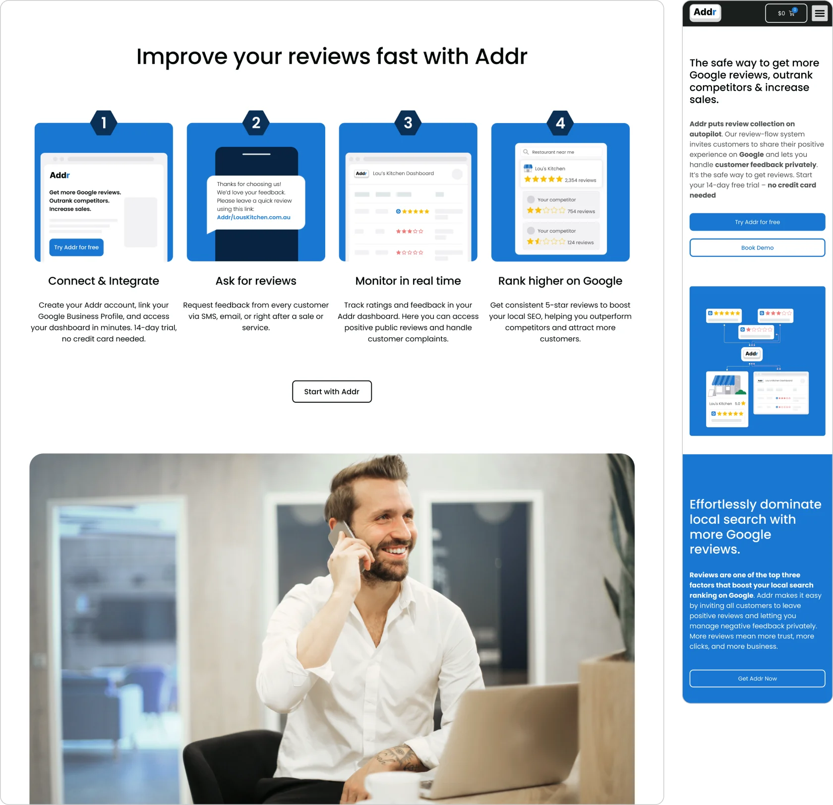
I split the work into two connected streams.
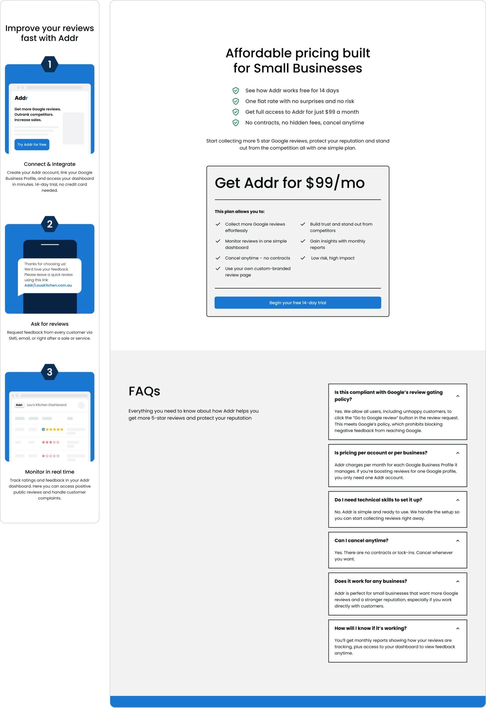
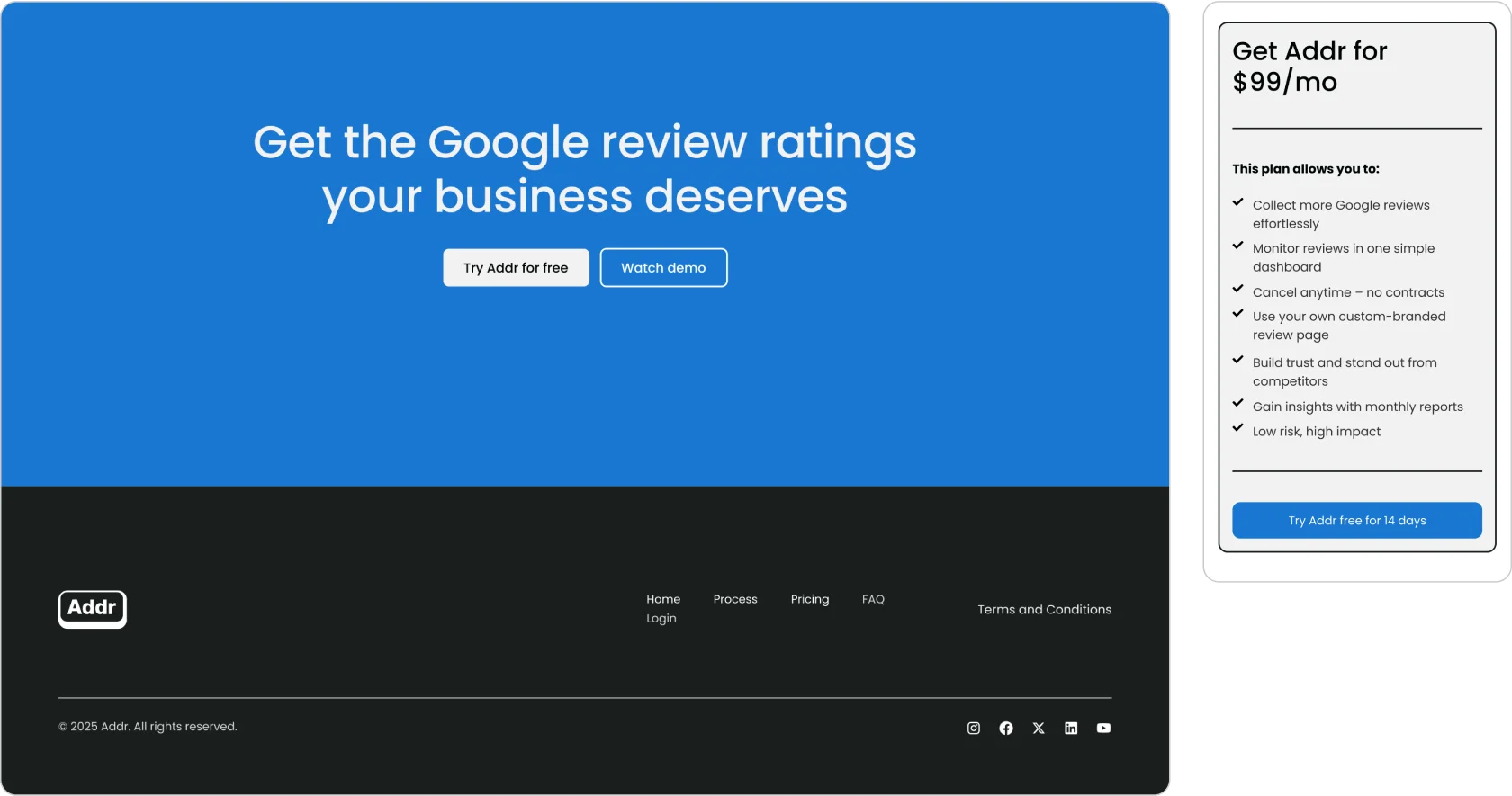
For the marketing website, I designed a clean, tech focused experience that explained the product clearly from the first screen and guided users toward subscription with minimal friction.
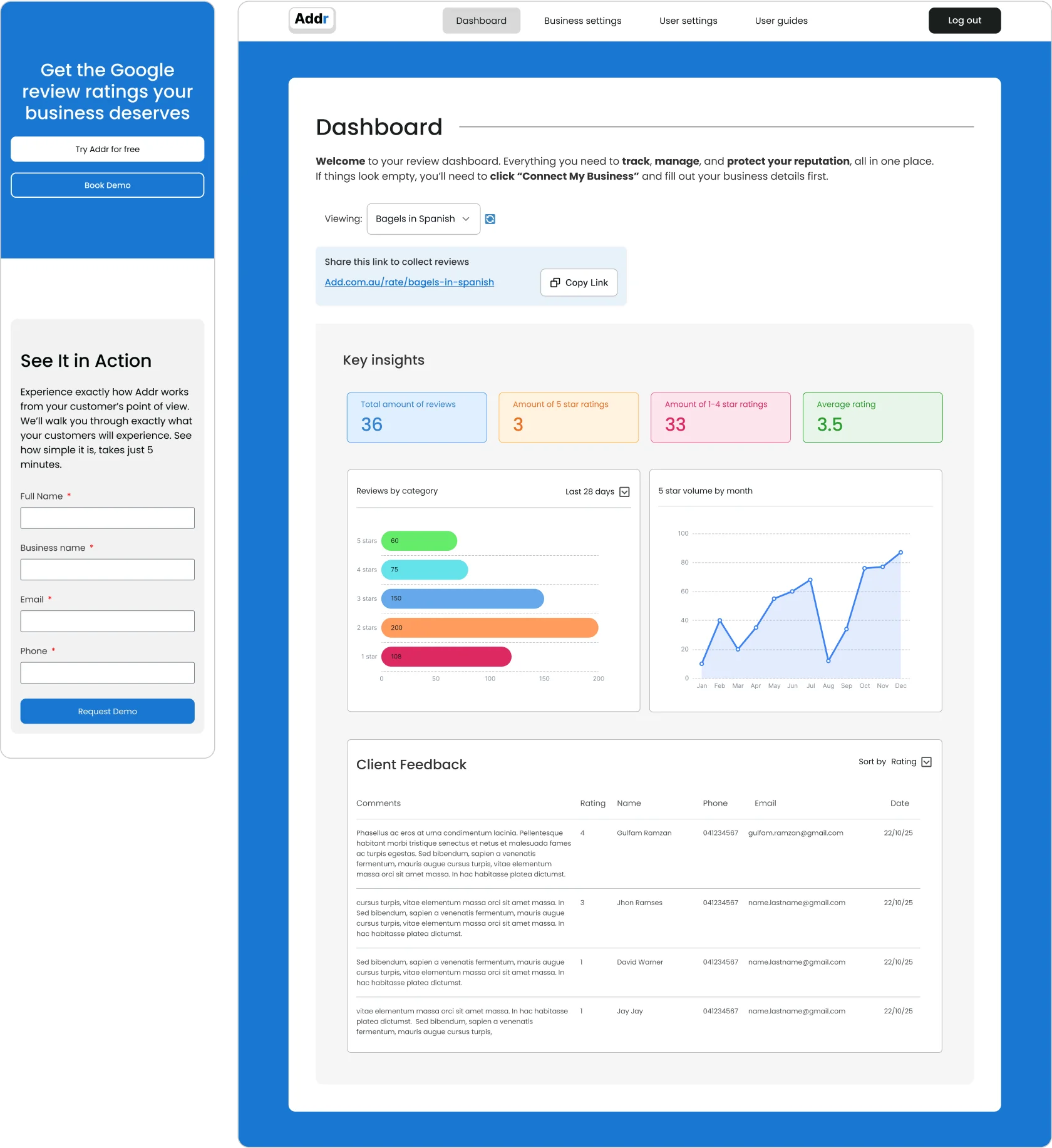
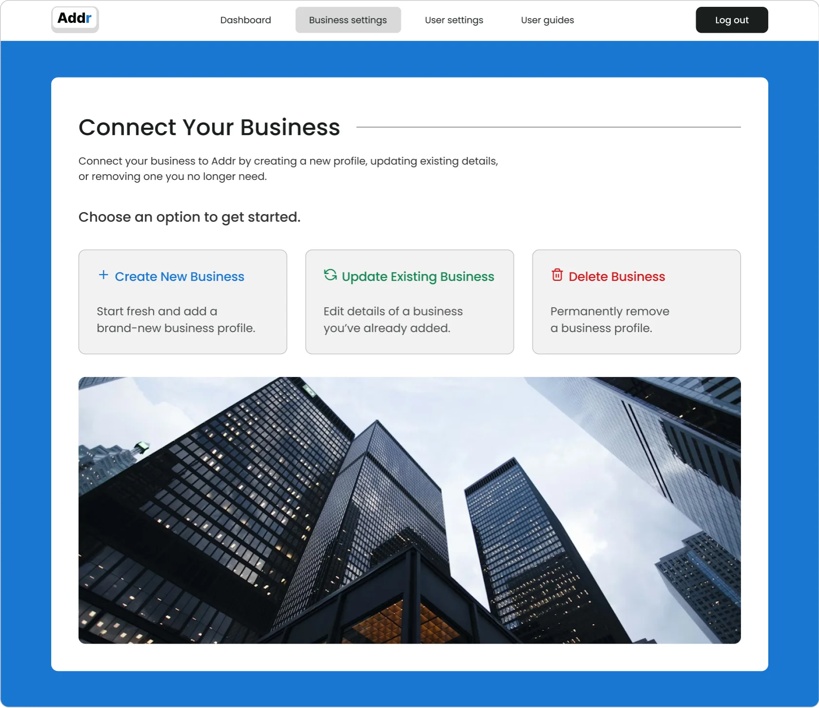
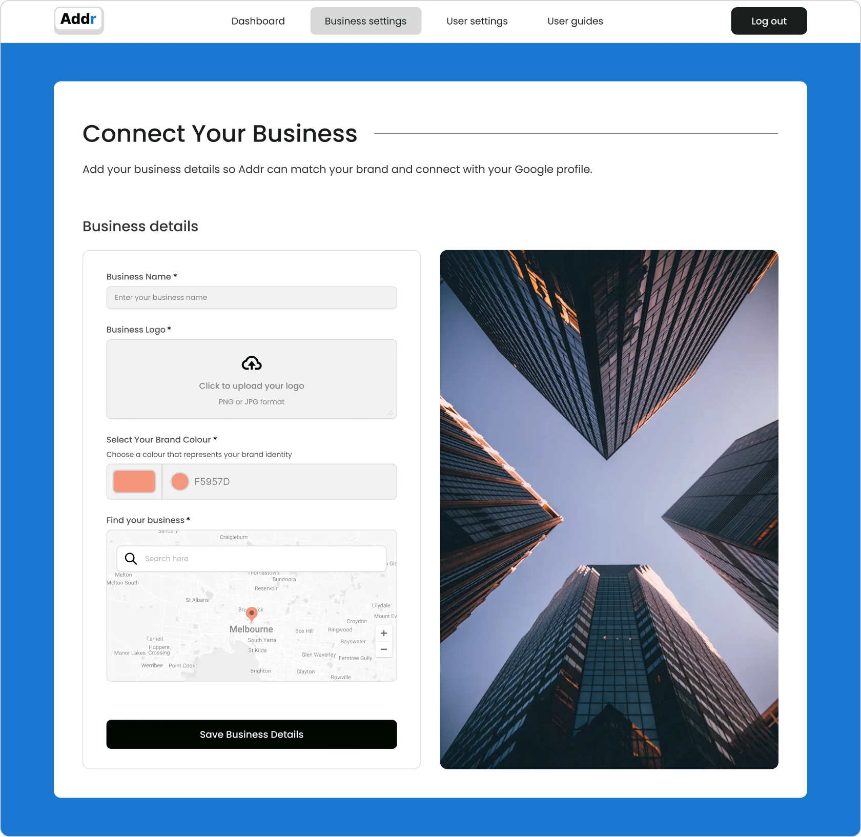
For the product, I focused on onboarding. I mapped and tested flows that helped new users create an account, configure their setup, and start using Addr without needing support.
Both streams were designed as one journey rather than separate pieces.
I worked across UX, UI, and frontend development.
On the website, I mapped the visitor journey, designed wireframes and high fidelity UI in Figma, and built the frontend in WordPress to move quickly under time constraints. I worked closely with a copywriter to simplify complex messaging and with a content creator to integrate videos and technical assets directly into the experience.
On the product side, I designed the onboarding flow and tested it with users to reduce early friction. I collaborated closely with the backend developer to connect the frontend with automations built in Make and Airtable, ensuring a smooth transition from sign up to setup.
Addr launched quickly with a professional and credible presence.
Users understood what the product did within seconds of landing on the site. Onboarding became easier to complete, and early customers were able to start using the product without hand holding.
Post launch, we monitored onboarding completion and early support requests to identify where users still hesitated and where future improvements would have the most impact.
Most importantly, the product now had a clear foundation to grow without adding unnecessary complexity too early.
“The site looks sharp and professional. Customers understand what we do right away, which is the hardest part. Explaining everything clearly from the hero section made a big difference. The site works smoothly and the experience has helped us convert more leads.” John K, Founder