Replacing assumptions with evidence to unlock user engagement.
Property Reviewed is Australia’s first property review platform, allowing tenants to share honest feedback on properties they have inspected or lived in. The platform was already live, but engagement and review submissions were lower than expected. The project focused on understanding why users were dropping off and improving key flows to support growth.
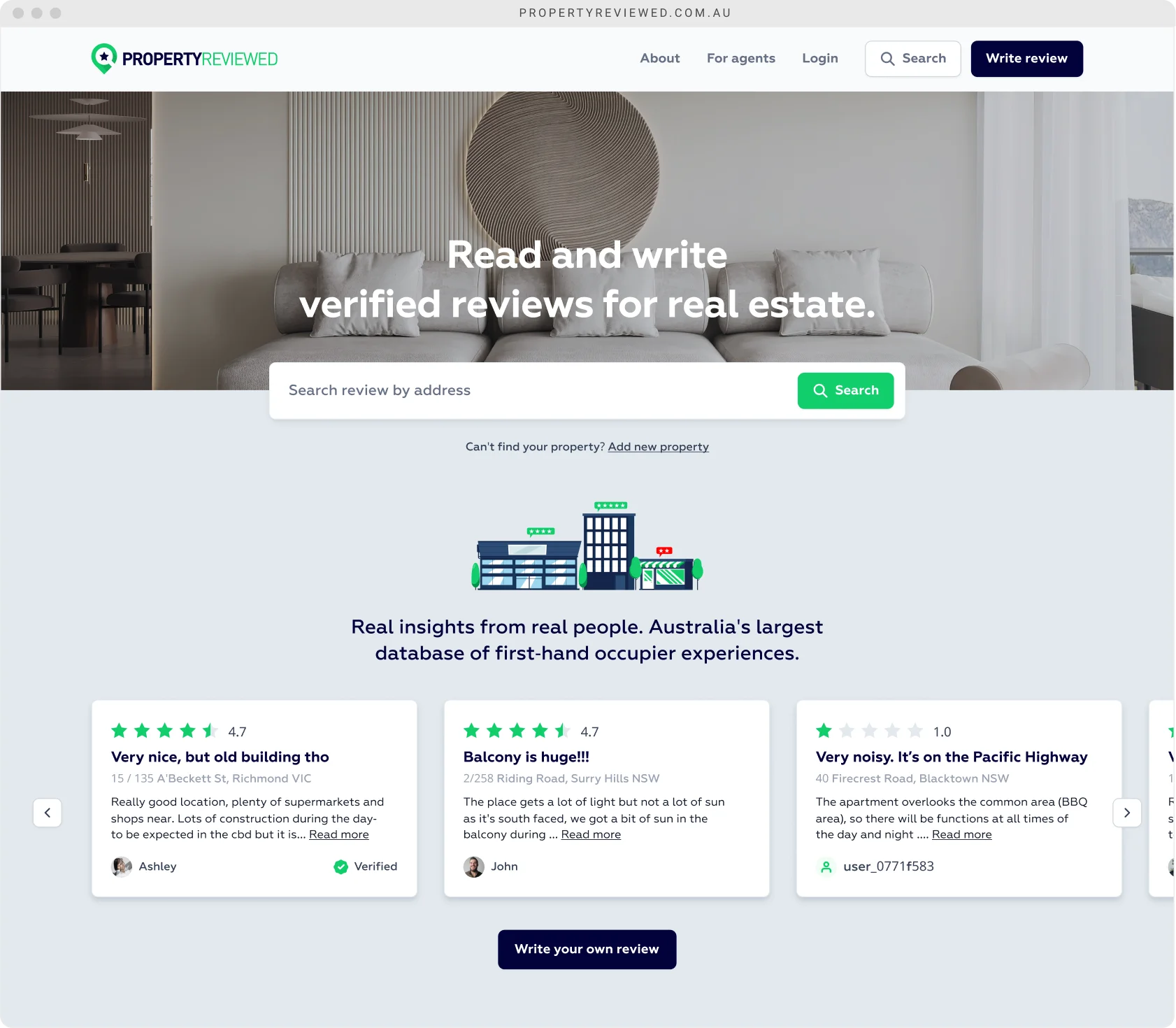
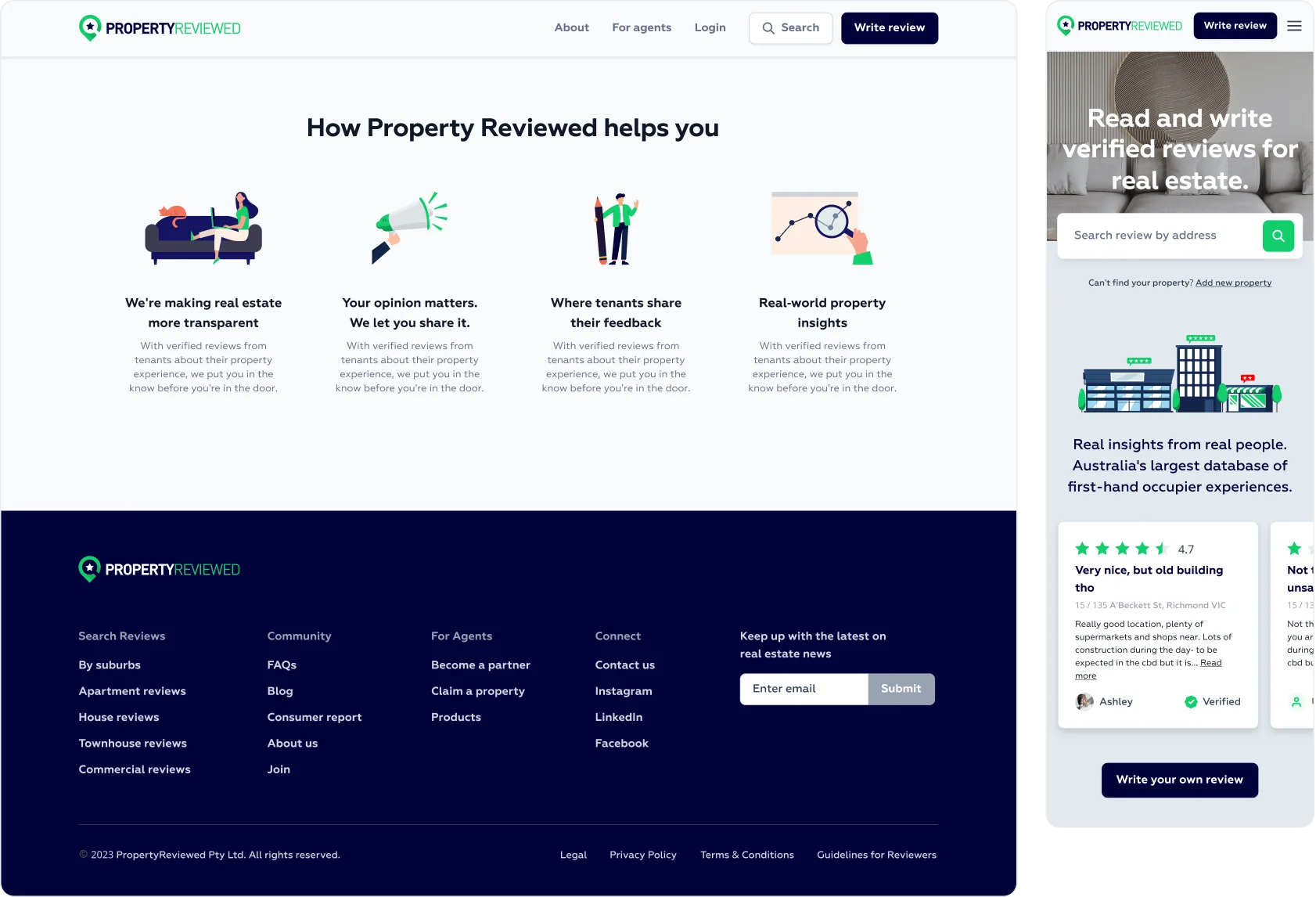
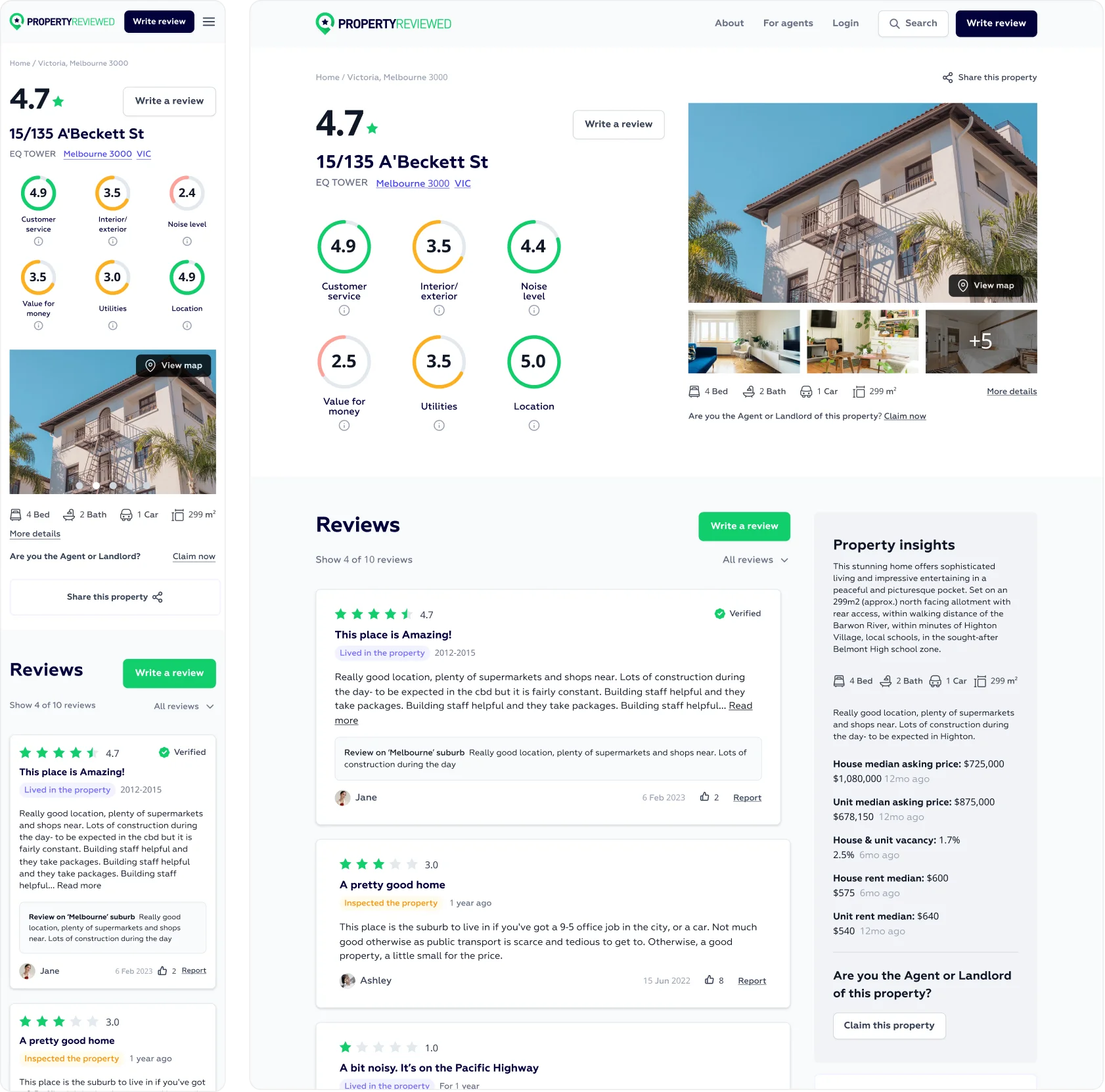
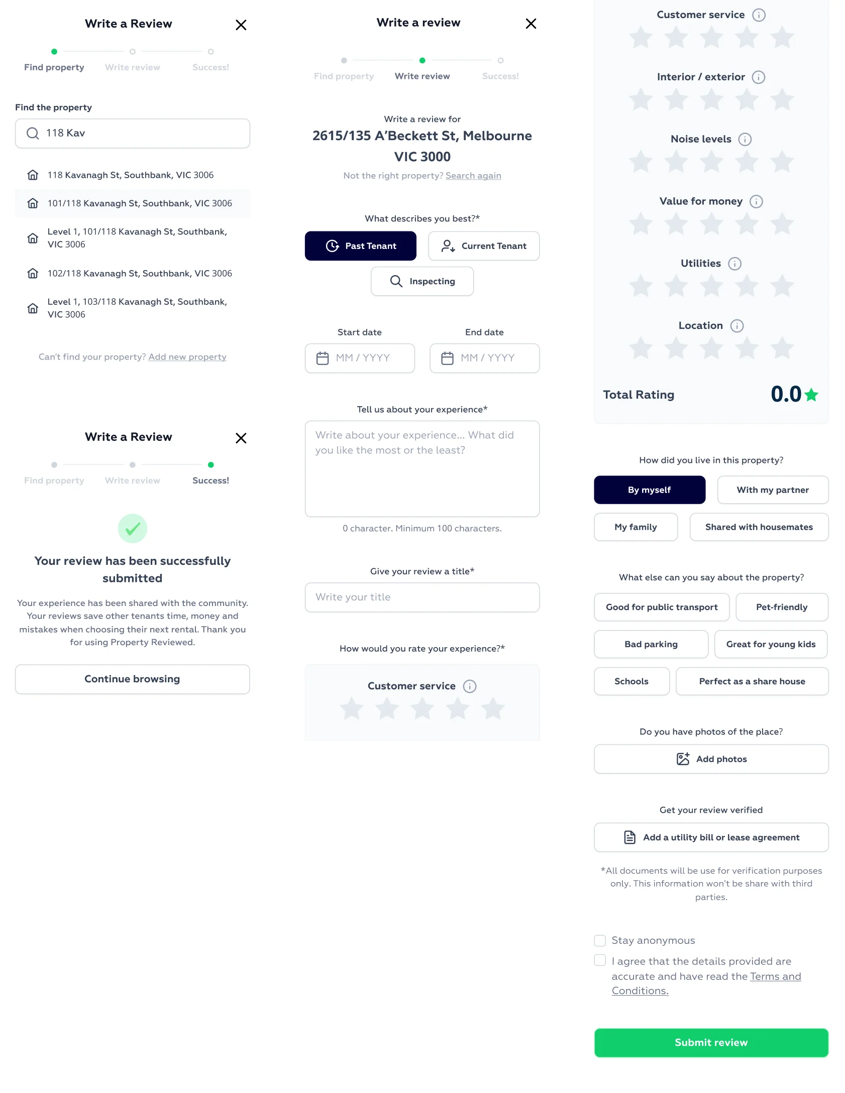
Users struggled to understand how to move through the platform. The homepage did not clearly communicate what to do next, property pages were overloaded with actions, and the review submission process felt long and intimidating. These issues created friction at critical moments, limiting engagement and reducing review completion.
The team needed answers quickly. There was no appetite for speculative feature work or extended redesign cycles. Any work had to be validated with real users and delivered in a way developers could act on immediately.
Early discussions leaned heavily on internal assumptions about what users wanted. Messaging and layout ideas were prioritised based on opinion rather than observed behaviour, which risked solving the wrong problems.
Moving fast based on assumptions would have saved time upfront, but increased the risk of shipping changes that failed to improve engagement. Introducing user testing added short-term effort but reduced uncertainty and aligned the team around real problems.
We shifted the team toward evidence-based decision making. Stakeholders participated in user testing sessions and directly observed where users became confused, hesitant, or disengaged. This created shared clarity and removed debate from prioritisation.
I helped facilitate a focused five-day design sprint to rapidly identify and validate improvements.
Day 1 focused on mapping the problem and defining a clear target.
Day 2 explored ideas through sketching.
Day 3 involved critique, voting, and storyboarding.
Day 4 produced a rapid prototype.
Day 5 tested solutions with real users.
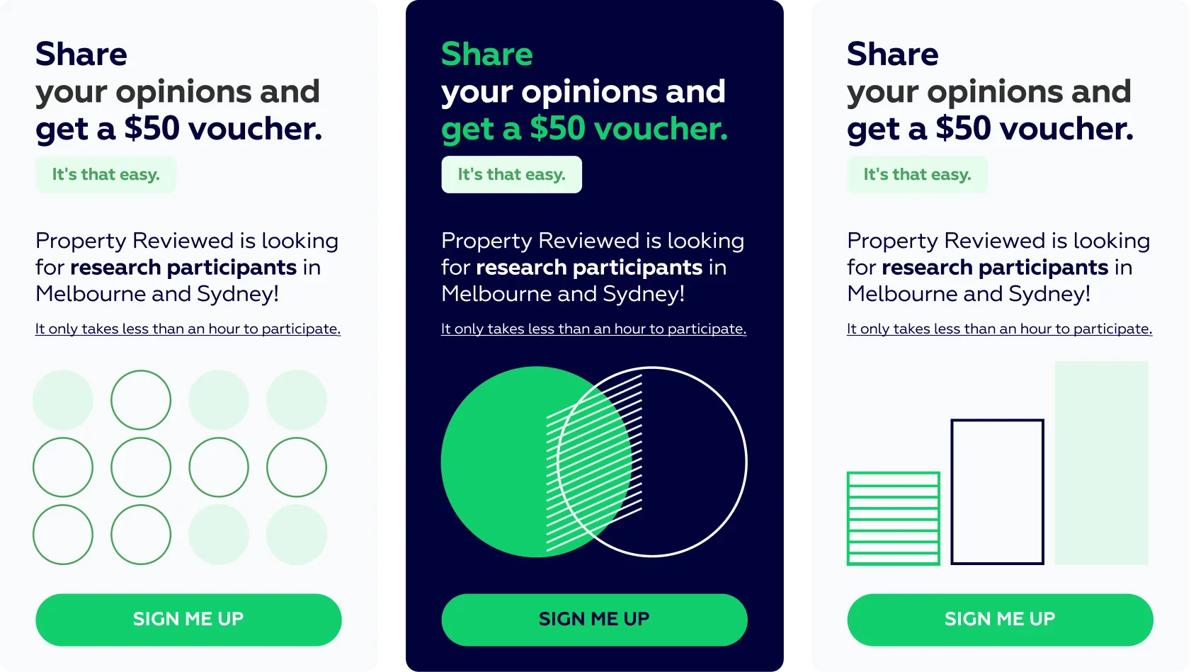
Additional testing sessions revealed key pain points and opportunities, which informed improved user flows, simplified navigation, clearer property information, and a more approachable review submission experience. The outcome was a more intuitive platform for both new and returning users.
UX Designer, contributing across research, design, and delivery within a small cross-functional team.
I supported the design sprint, ran user testing sessions, and synthesised insights into clear priorities. I co-created user journeys, wireframes, and high-fidelity prototypes in Figma, working closely with the design lead to shape the overall experience. I collaborated with developers throughout to ensure designs were practical, well-documented, and ready for implementation.
Actionable insights and validated designs delivered within weeks Clearer flows that reduced confusion and made writing reviews easier Stronger understanding of user priorities, including demand for richer data Faster development due to well-structured, test-backed design files A visible shift toward a user-first culture across the team
“The sprint gave us clarity, confidence, and a clear way forward. It inspired the team to embrace a more user-first culture and gave us requirements we could put straight into production.” Alvin H.