
Life saving first aid
About
Life Saving First Aid is a CPR and first aid training provider in Victoria. I collaborated with its visionary founders, Daniel and Natasha, right from the beginning to establish and develop the brand.
Life Saving First Aid is a CPR and first aid training provider in Victoria. I collaborated with its visionary founders, Daniel and Natasha, right from the beginning to establish and develop the brand.
My role
UI/UX design, Usability testing, Prototyping, Brand and identity design, Marketing collateral
UI/UX design, Usability testing, Prototyping, Brand and identity design, Marketing collateral
Project team
Daniel, Natasha, Adrian, Melissa and Nic
Year
2022
Daniel, Natasha, Adrian, Melissa and Nic
Year
2022

Goals
Create an educational, positive, and empowering brand. Align website design and branding with company values and target audience. Conduct user testing to identify pain points. Create a cohesive and recognizable brand identity.
Create an educational, positive, and empowering brand. Align website design and branding with company values and target audience. Conduct user testing to identify pain points. Create a cohesive and recognizable brand identity.
Challenges
Educate stakeholders about the importance of user experience (UX) and its impact on business success. The poorly designed website and lack of recognizable branding harmed the business, creating doubts and uncertainty among customers.
Educate stakeholders about the importance of user experience (UX) and its impact on business success. The poorly designed website and lack of recognizable branding harmed the business, creating doubts and uncertainty among customers.
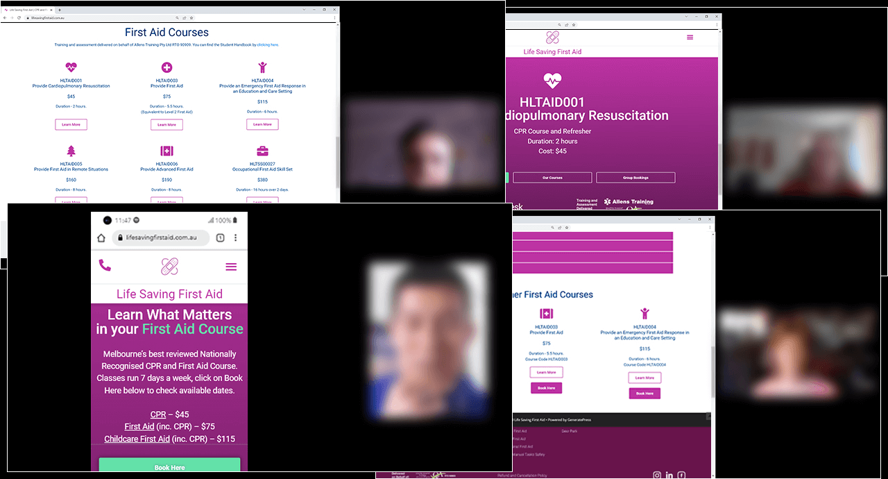
Usability testing
After a discovery session with stakeholders, I conducted 10 sessions of user testing, on the current site. We brought in a diverse group of participants to gather valuable insights.
After a discovery session with stakeholders, I conducted 10 sessions of user testing, on the current site. We brought in a diverse group of participants to gather valuable insights.
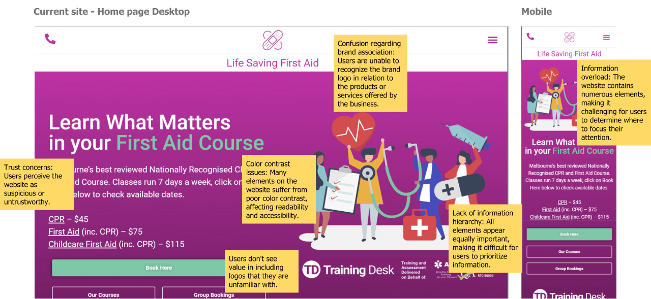
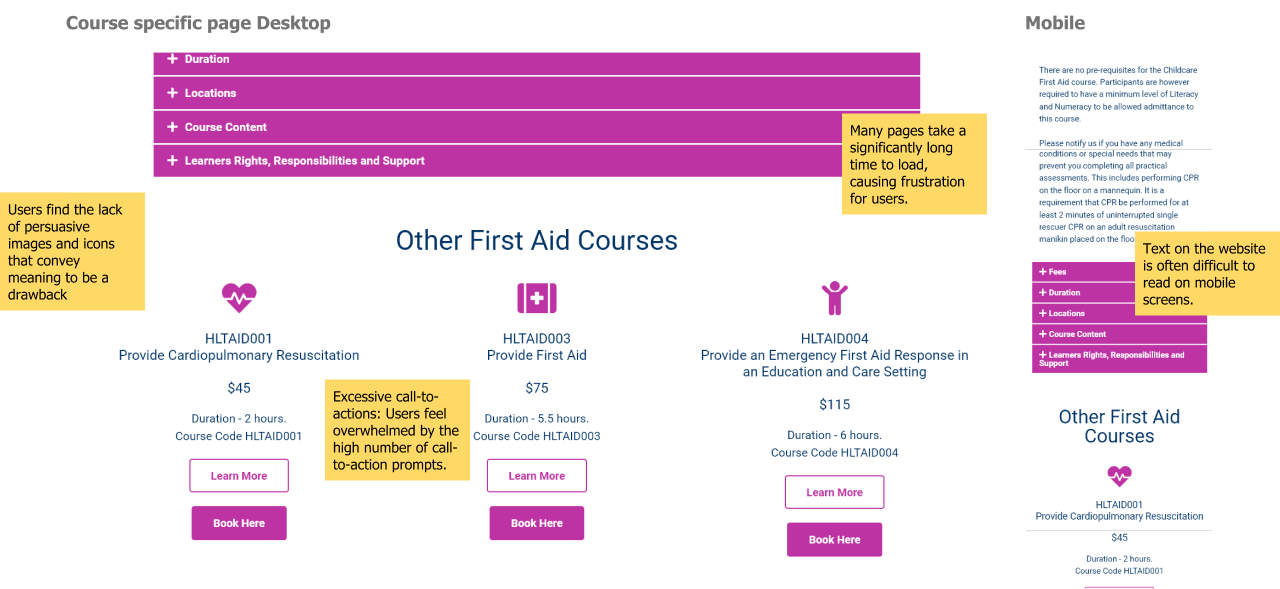
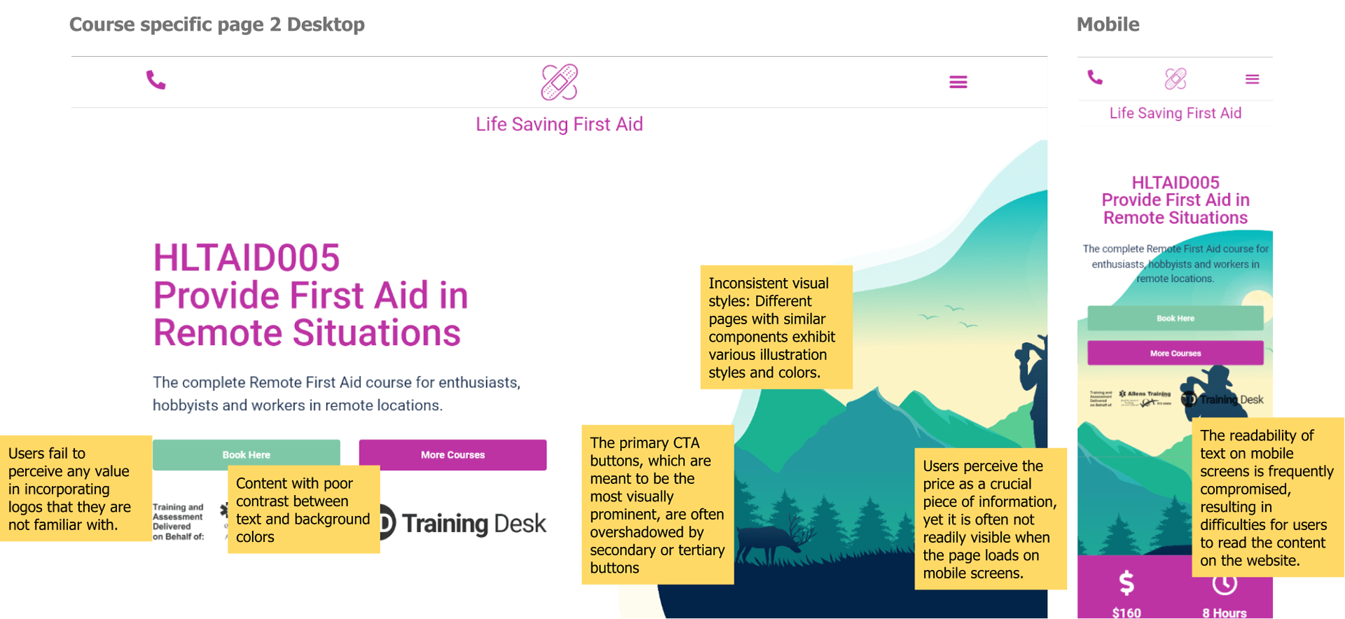
Testing findings
Users encountered frustrating issues with the website, such as slow loading times, broken pages, and confusing navigation. The website needed a stronger brand presence, affecting its credibility.
Users encountered frustrating issues with the website, such as slow loading times, broken pages, and confusing navigation. The website needed a stronger brand presence, affecting its credibility.
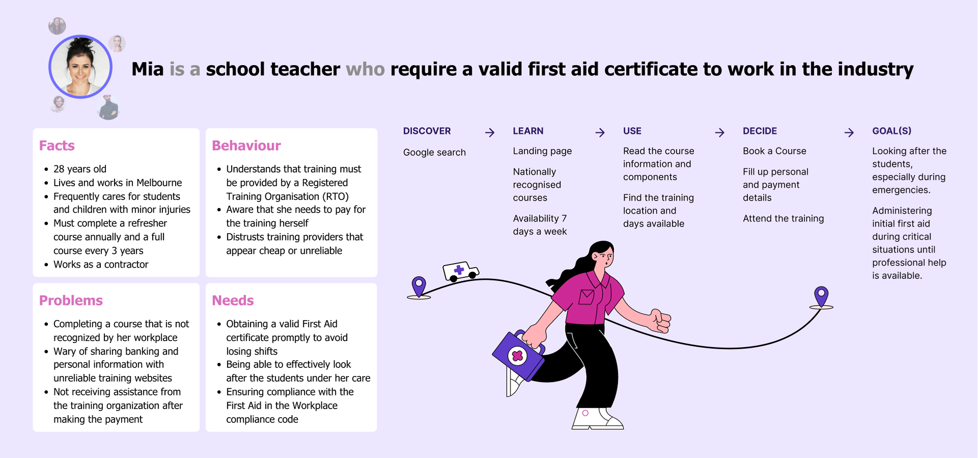
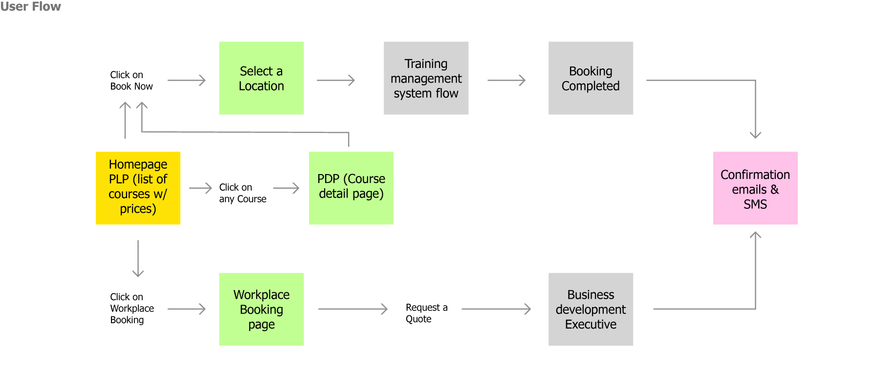
User Journey
After doing the user interviews, we obtained a thorough understanding of how users engage with the product. This knowledge enabled us to create a smoother and more unified user journey, taking into account user preferences and pain points. The result was an improved overall user experience, making the product more intuitive.
After doing the user interviews, we obtained a thorough understanding of how users engage with the product. This knowledge enabled us to create a smoother and more unified user journey, taking into account user preferences and pain points. The result was an improved overall user experience, making the product more intuitive.
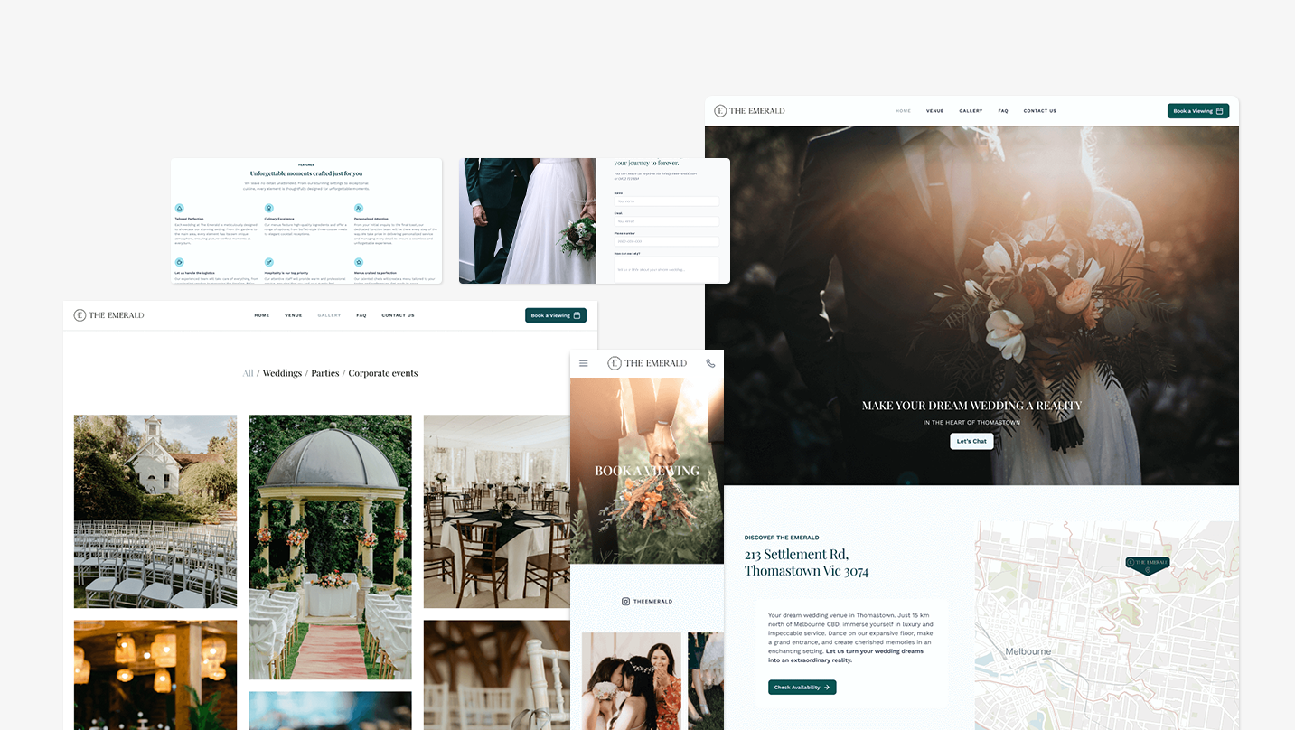
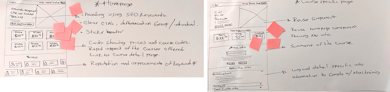
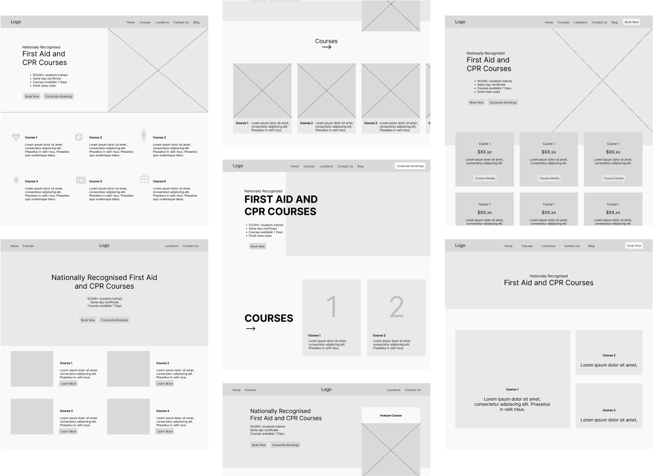
Storyboards
After the user journey was completed, we had a solution sketch session always remembering our target users and their needs. Then, I crafted wireframes for essential pages, prioritizing the "Book Now" call-to-action. The result was clean pages that displayed key information prominently.
After the user journey was completed, we had a solution sketch session always remembering our target users and their needs. Then, I crafted wireframes for essential pages, prioritizing the "Book Now" call-to-action. The result was clean pages that displayed key information prominently.
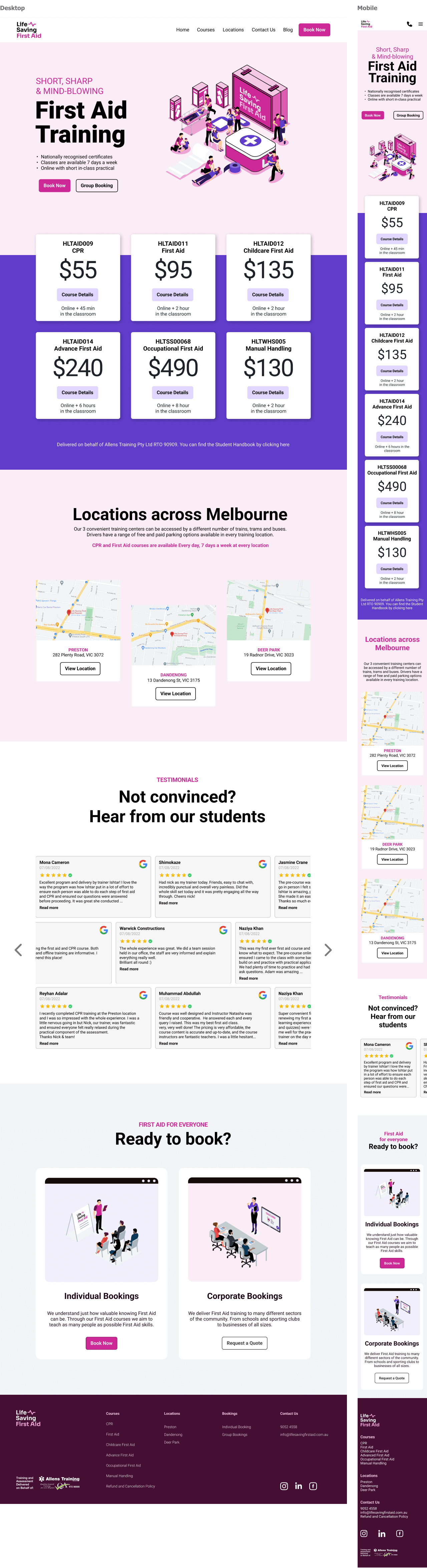
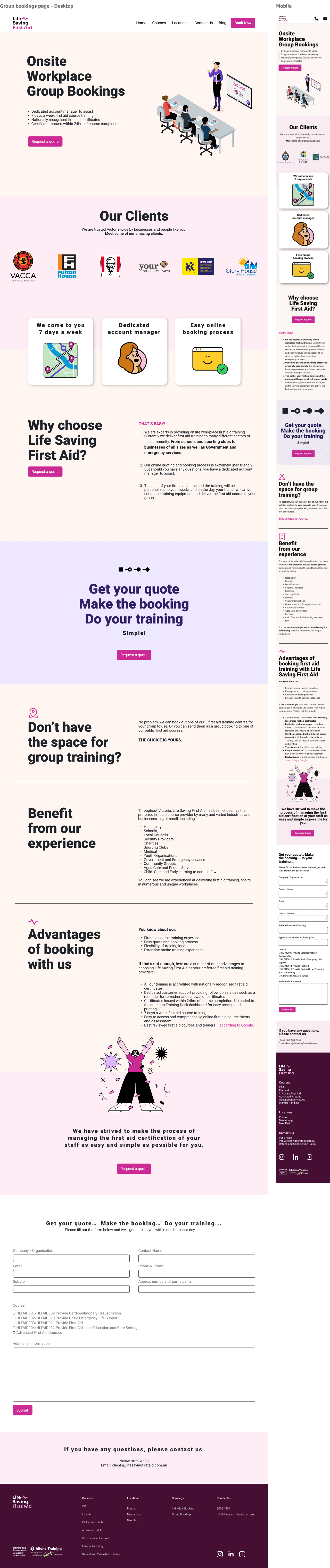
Prototypes
After the wireframes were approved, I utilized Figma to transform them into clickable high-res prototypes by incorporating interactions and transitions.
After the wireframes were approved, I utilized Figma to transform them into clickable high-res prototypes by incorporating interactions and transitions.
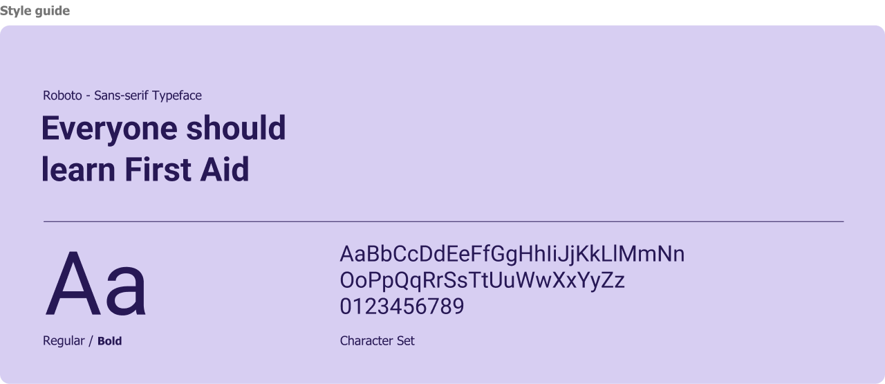
UI Specific
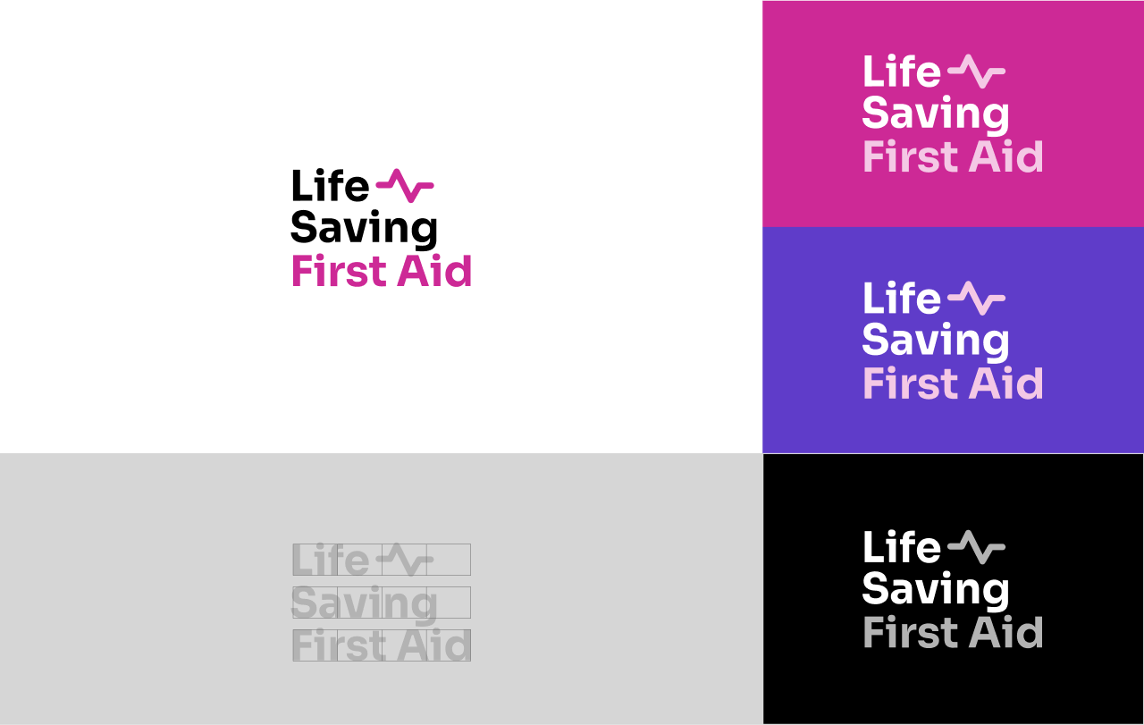
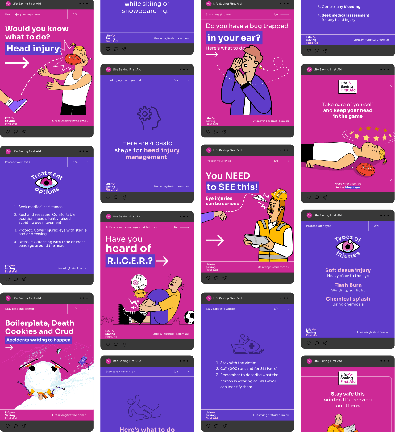
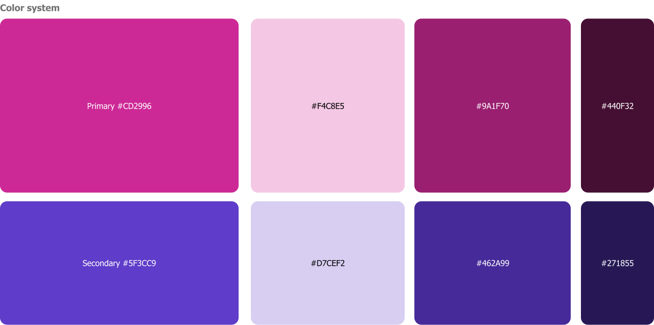
For the colour palette, I use Pink and Purple as my primary and secondary colours. Pink was a bold option that work perfectly for their target audience. The key was to be subtle with its use and apply it only to highlight headings or parts of illustrations. In terms of typography, I used "Roboto typeface" a contemporary font with multiple weights, throughout the entire website. Finally, I used tailored illustrations that make the brand modern and fresh and make them stand apart from the competition. The illustrations were later adopted throughout the whole brand and implemented in social media, marketing and other customer-facing touch points.
For the colour palette, I use Pink and Purple as my primary and secondary colours. Pink was a bold option that work perfectly for their target audience. The key was to be subtle with its use and apply it only to highlight headings or parts of illustrations. In terms of typography, I used "Roboto typeface" a contemporary font with multiple weights, throughout the entire website. Finally, I used tailored illustrations that make the brand modern and fresh and make them stand apart from the competition. The illustrations were later adopted throughout the whole brand and implemented in social media, marketing and other customer-facing touch points.
Conclusion
Stakeholders recognized the importance of UX design and brand experience. The redesigned website led to increased sales and improved SEO scores. It effectively reflects the branding elements with a clean and intuitive design. Their social media audience has tripled within a month of implementing the new illustration style and brand voice.
Stakeholders recognized the importance of UX design and brand experience. The redesigned website led to increased sales and improved SEO scores. It effectively reflects the branding elements with a clean and intuitive design. Their social media audience has tripled within a month of implementing the new illustration style and brand voice.
Other assets
Although they were outside the scope of the UX project, I developed the logo, Instagram and social media assets, and overall branding based on feedback gathered from user testing sessions.
Although they were outside the scope of the UX project, I developed the logo, Instagram and social media assets, and overall branding based on feedback gathered from user testing sessions.