
Property Reviewed
About
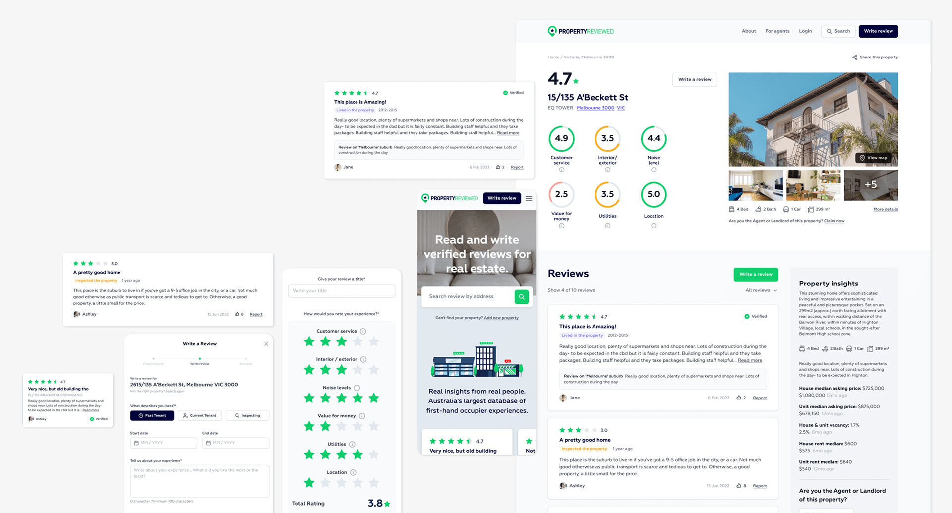
Property Reviewed is Australia's first online review platform for the property industry, empowering tenants to share valuable feedback on inspected or lived-in properties to help others make informed decisions.
Property Reviewed is Australia's first online review platform for the property industry, empowering tenants to share valuable feedback on inspected or lived-in properties to help others make informed decisions.
My role
UI/UX design, Usability testing, Prototyping
UI/UX design, Usability testing, Prototyping
Project team
Jess, Alvin, Steve, Daniel and Nic
Year
2023
Jess, Alvin, Steve, Daniel and Nic
Year
2023
Live site
https://propertyreviewed.com.au/
https://propertyreviewed.com.au/
Goal
We embarked on a design sprint to enhance the user experience, identify key user issues, and propose solutions through design and prototyping.
We embarked on a design sprint to enhance the user experience, identify key user issues, and propose solutions through design and prototyping.
Challenges
Tackling user drop-off and disengagement by analyzing the user journey and key pages. Our aim was to boost conversion rates and improve site traffic.
Tackling user drop-off and disengagement by analyzing the user journey and key pages. Our aim was to boost conversion rates and improve site traffic.
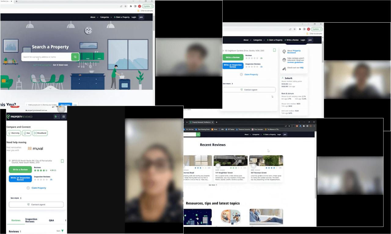
Usability testing
We recruited and conducted user testing sessions with participants from Melbourne and Sydney, both existing users and non-users. Through 1-to-1 user interview sessions conducted between Alvin and me, coupled with team observation and note-taking in parallel we were able to gain both qualitative and quantitative insights.
We recruited and conducted user testing sessions with participants from Melbourne and Sydney, both existing users and non-users. Through 1-to-1 user interview sessions conducted between Alvin and me, coupled with team observation and note-taking in parallel we were able to gain both qualitative and quantitative insights.
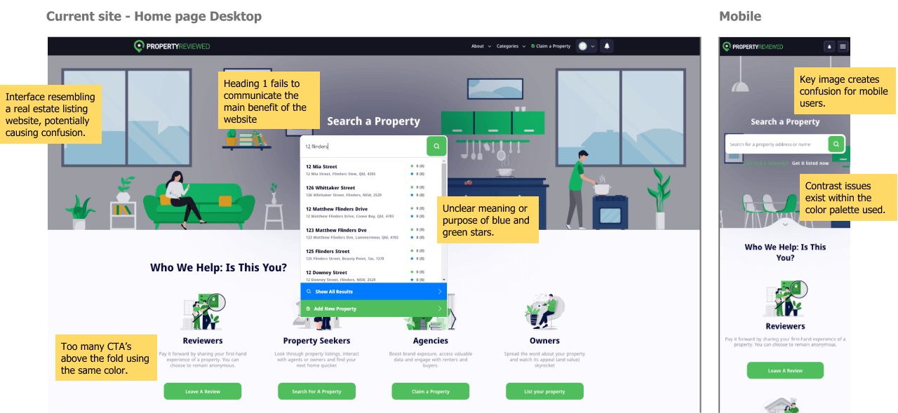
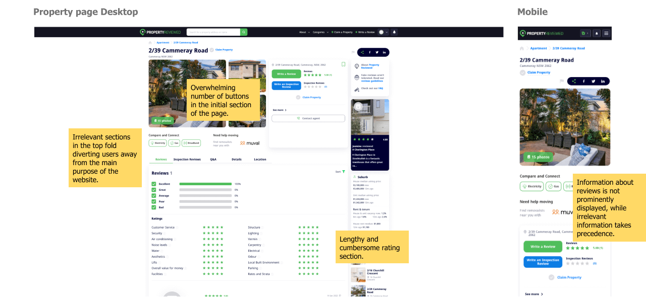
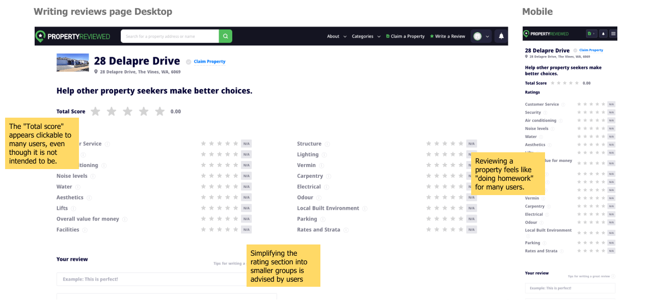
Testing findings
Users found the homepage confusing and struggled with the detail page due to excessive buttons and unclear labels. Writing reviews was overwhelming and time-consuming, resulting in fewer contributions.
Users found the homepage confusing and struggled with the detail page due to excessive buttons and unclear labels. Writing reviews was overwhelming and time-consuming, resulting in fewer contributions.
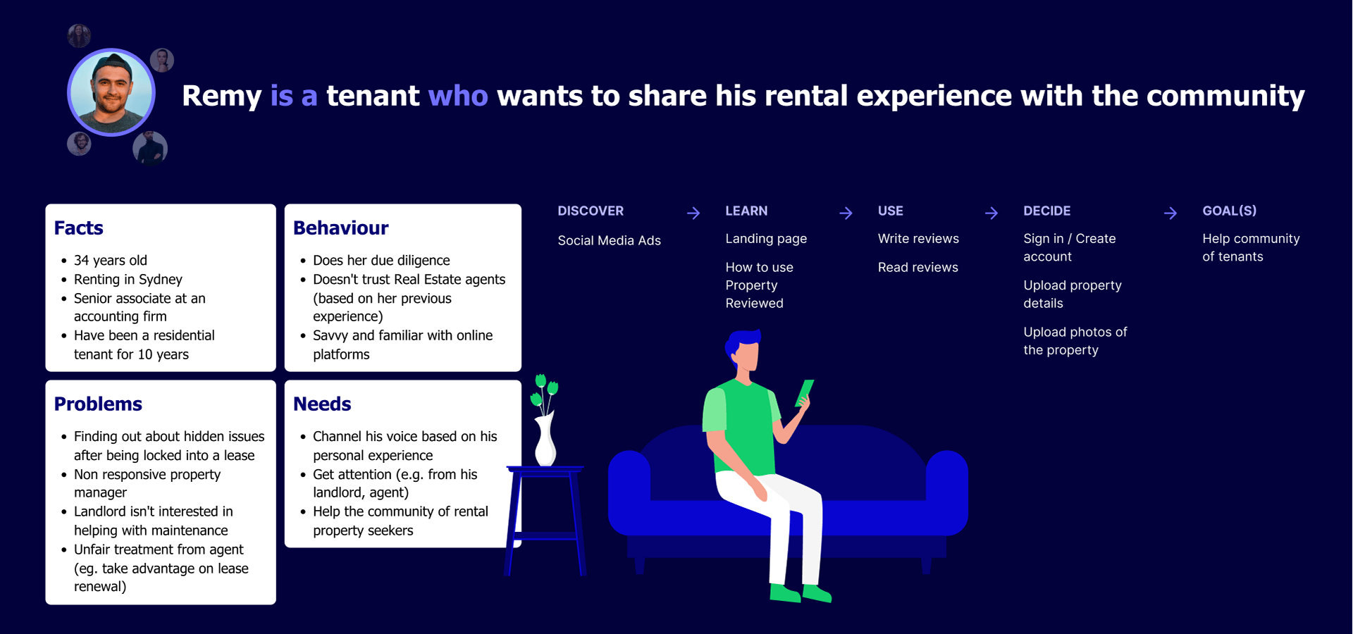
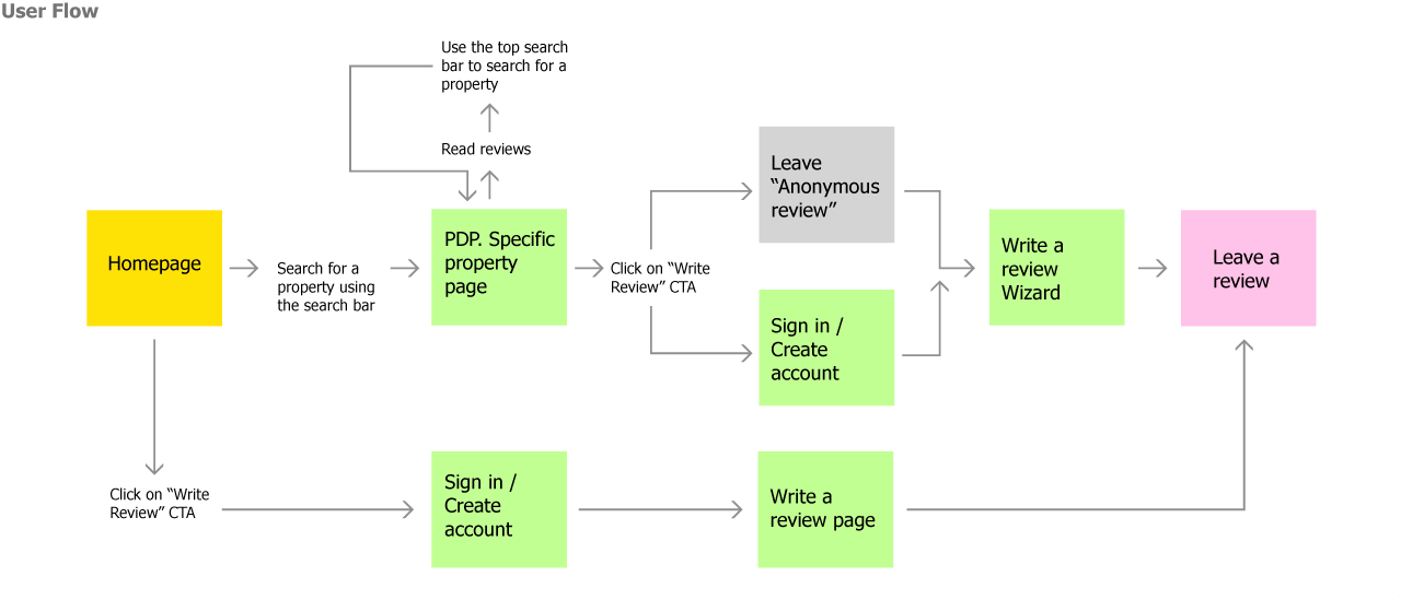
User Journey
By using a user experience map, we gained a comprehensive understanding of the user's interactions and touchpoints within the product. This insight allowed us to craft a more seamless and cohesive experience. Through this process, we successfully enhanced the overall user experience, resulting in a more intuitive and satisfying product.
By using a user experience map, we gained a comprehensive understanding of the user's interactions and touchpoints within the product. This insight allowed us to craft a more seamless and cohesive experience. Through this process, we successfully enhanced the overall user experience, resulting in a more intuitive and satisfying product.
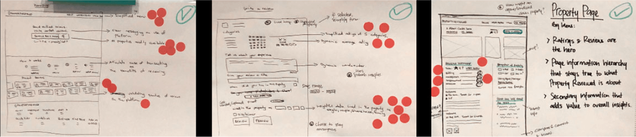
Storyboard
We began by redesigning the user flow, conducting a solution sketch session, creating mock-ups of crucial pages, and prioritizing a simplified interface that emphasized important review information and intuitive actions. Jess and I, both designers, collaborated concurrently on various pages and components using Mural, a whiteboard app, to develop wireframes.
We began by redesigning the user flow, conducting a solution sketch session, creating mock-ups of crucial pages, and prioritizing a simplified interface that emphasized important review information and intuitive actions. Jess and I, both designers, collaborated concurrently on various pages and components using Mural, a whiteboard app, to develop wireframes.
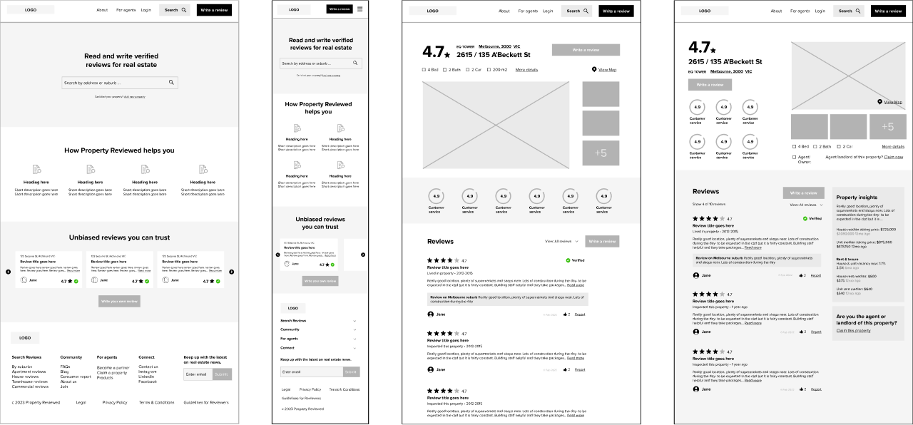
Prototypes
After the wireframes were approved, we utilized Figma to transform them into clickable high-res prototypes by incorporating interactions and transitions.
After the wireframes were approved, we utilized Figma to transform them into clickable high-res prototypes by incorporating interactions and transitions.
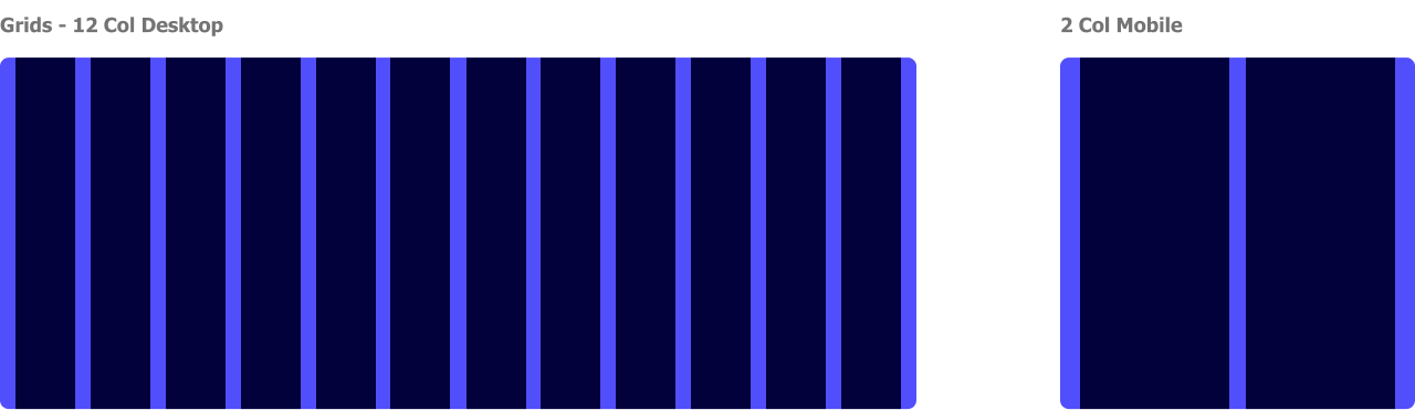
UI Specific
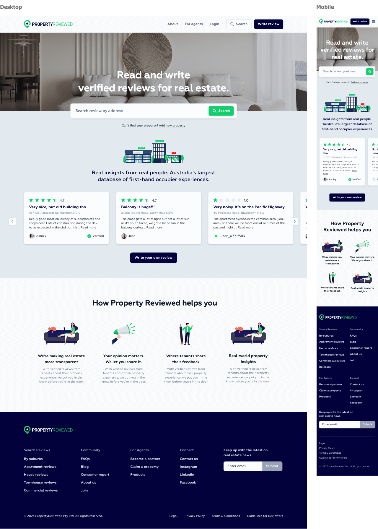
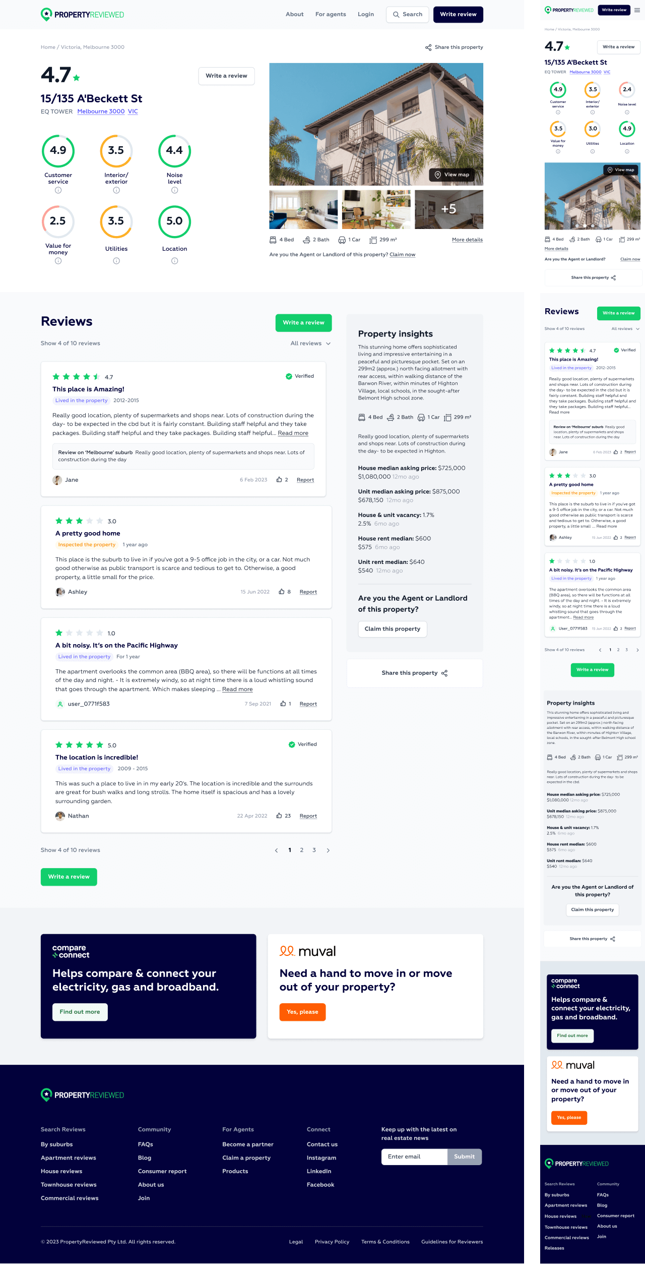
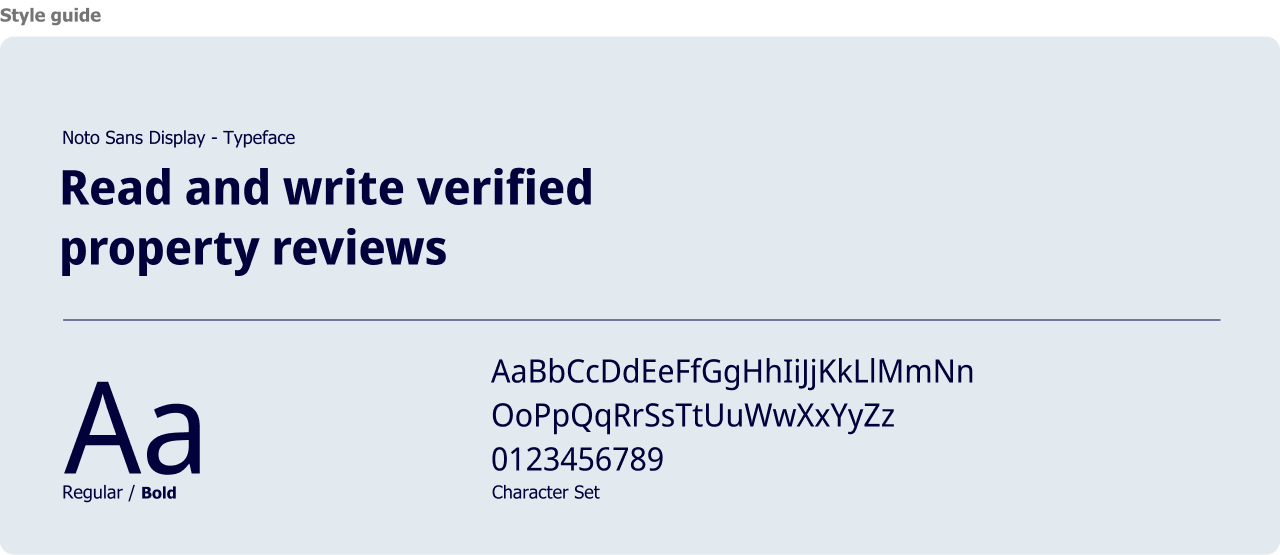
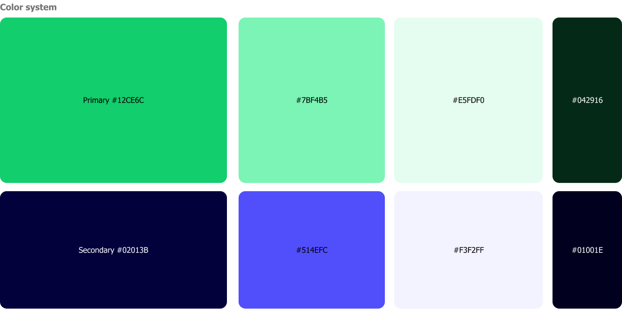
For the colour palette, we chose a modern green and dark blue as our primary and secondary colours, and use layouts that kept us away from the typical Real Estate aesthetics. In terms of typography, we adhered to the brand's style guide and used "Noto Sans Display", a contemporary font with multiple weights. This types add a touch of modernity and enhance readability.
For the colour palette, we chose a modern green and dark blue as our primary and secondary colours, and use layouts that kept us away from the typical Real Estate aesthetics. In terms of typography, we adhered to the brand's style guide and used "Noto Sans Display", a contemporary font with multiple weights. This types add a touch of modernity and enhance readability.
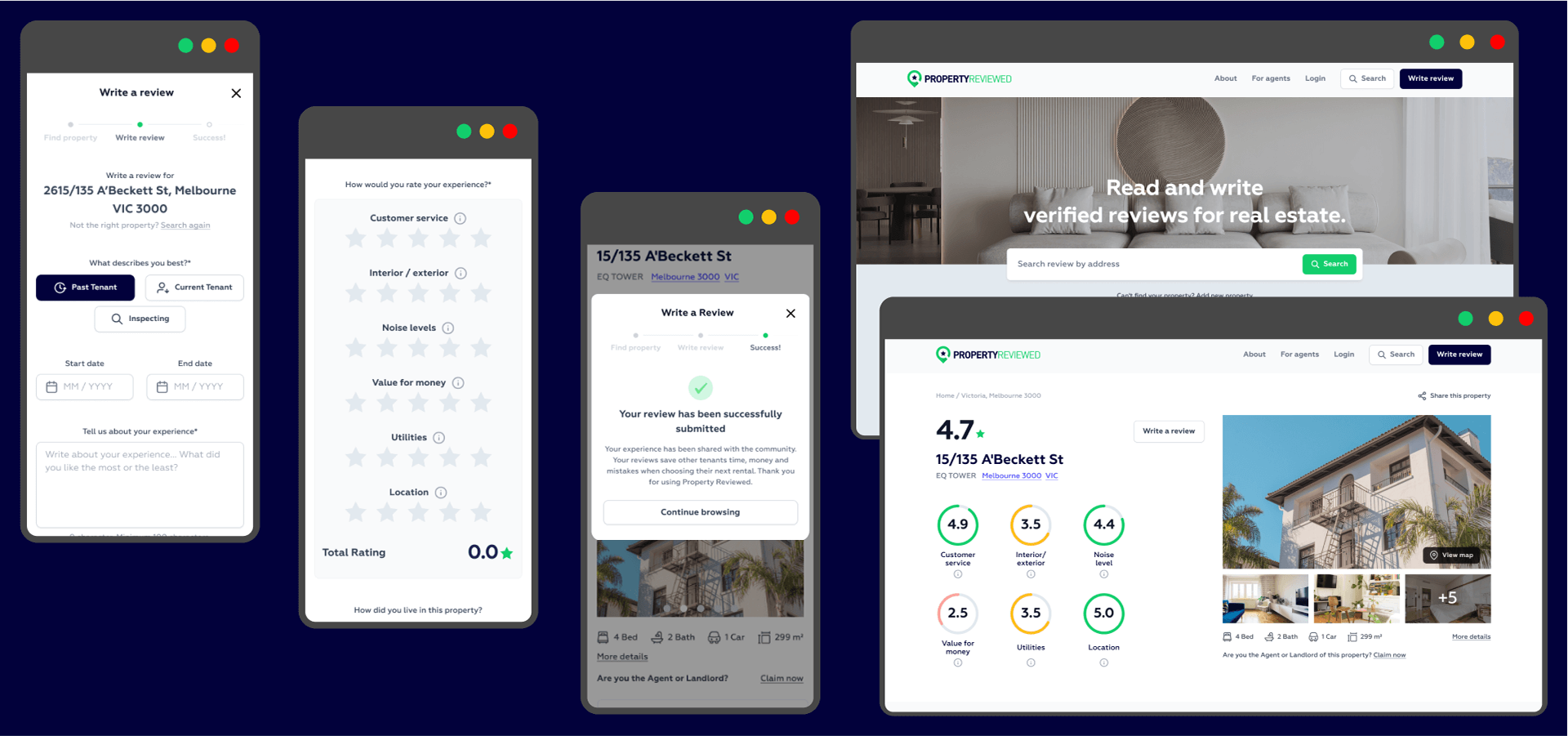
Conclusion
The project was successfully handed off to the client developers for implementation and subsequently went live in the first half of 2023. Our user-centric approach prioritized clarity and emphasized the power of reviews. By reducing information overload and streamlining the experience, we've created an efficient platform that puts users first.